
Quick Answer: Spring wedding color palettes feature soft pastels like blush and butter yellow, bold pairings like coral and navy, earthy tones like sage and terracotta, and modern editorial blends like mauve and dusty blue that capture the season’s natural freshness.
Spring is the season where color choices matter most. The light is golden, gardens are blooming, and your palette will set the entire mood, whether romantic and soft or bold and modern. The best spring wedding color palette ideas pull from nature first and trend reports second, so the look feels timeless instead of chasing whatever was viral six months ago.
This guide covers 18 palette ideas across pastels, bold combos, earthy naturals, garden whimsy, and modern editorial blends. Pair it with our spring wedding ideas guide, our spring wedding flower bouquet guide, and our summer wedding color palette guide for cross-season inspiration.
Planning your spring wedding without losing your mind?
The Ultimate DIY Wedding Planner walks you through every detail with checklists, vendor questions, and timeline templates. Currently just $4.99 before the price goes up to $19.99.


Recommended blogs to read:
- Budget-Friendly Spring Wedding Planning Tips
- Top 16 Spring Wedding Flower Bouquet Ideas
- Top 18 Summer Wedding Color Palette Ideas
- Top 18 Summer Wedding Themes
- Spring Graduation Party Decor Ideas
Soft & Romantic Pastels
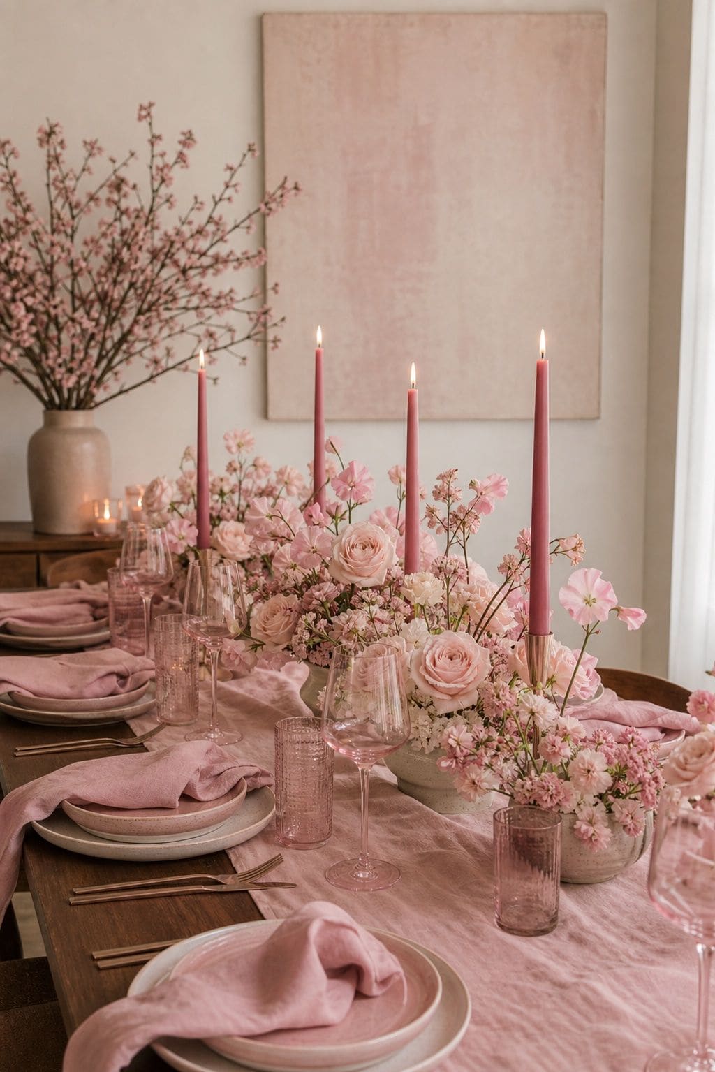
1. Blush Pink, Cream, and Champagne
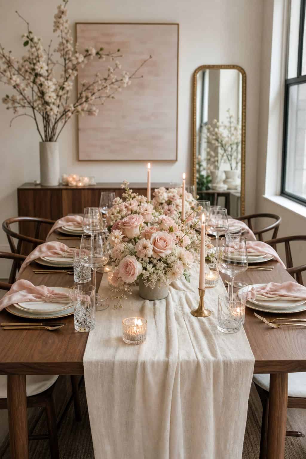


The classic spring romance palette. Blush pink florals, cream linens, and champagne metallics create a soft, golden-hour mood that suits garden, vineyard, and chapel weddings beautifully. This palette photographs richly in soft natural light and works for both traditional and modern aesthetics.
Add depth with dusty rose accents in bridesmaid dresses or napkins, then anchor with greenery to keep it feeling fresh rather than overly sweet.
Read more: Top 15 Spring Tiered Tray Decor Ideas for an Instant Seasonal Refresh
2. Butter Yellow, White, and Sage Green
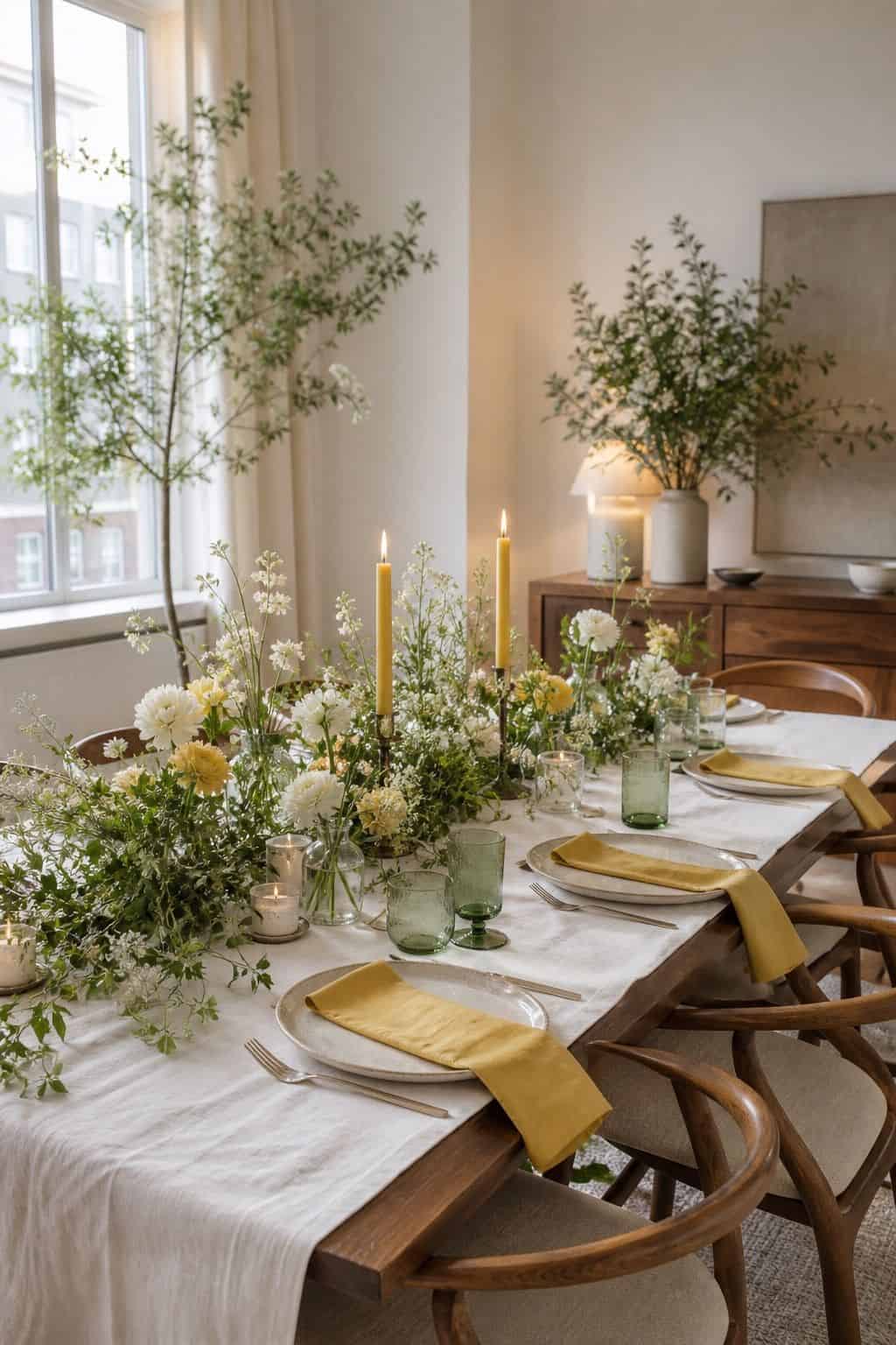


A buttery yellow palette has emerged as the 2026 spring favorite, especially with white and sage green. The combination feels fresh and cheerful without crossing into childish, and it photographs beautifully in golden hour outdoor light. Use yellow for napkins, table runners, and a few floral accents like Genestra broom or daffodils.
3. Lavender, Lilac, and Soft Cream
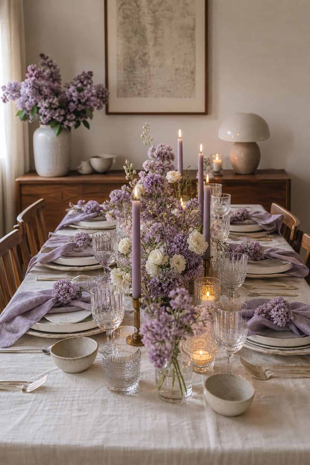


A purple-forward spring palette built around lavender and lilac with cream linens feels both nostalgic and current. Pair lavender table linens with white florals and silver flatware for an editorial spring garden look that suits both indoor and outdoor venues.
Read more: Top 16 Spring Decor Ideas for the Kitchen That Feel Bright and Clean
4. Peach, Apricot, and Soft Coral
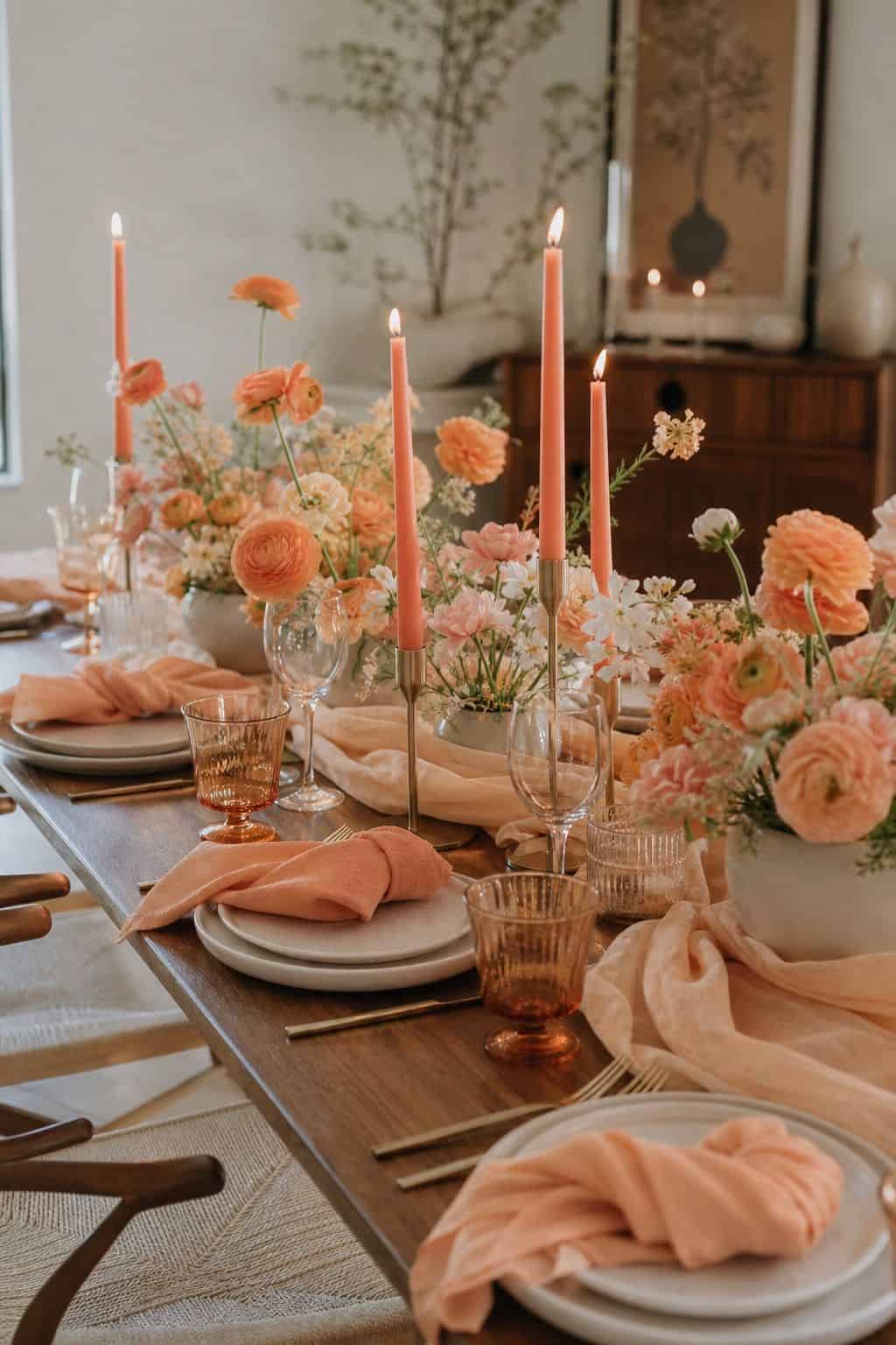


Warm peach and apricot tones bring sunset-inspired warmth to spring weddings. Layer with cream and a touch of dusty rose for a palette that translates beautifully across florals, linens, and bridesmaid attire. Pair with our spring wedding flower bouquet ideas for matching florals.
Read more: Top 16 Spring Decor Ideas for the Bathroom That Feel Spa-Fresh
Bold & Lively Combos
5. Coral, Navy, and Cream
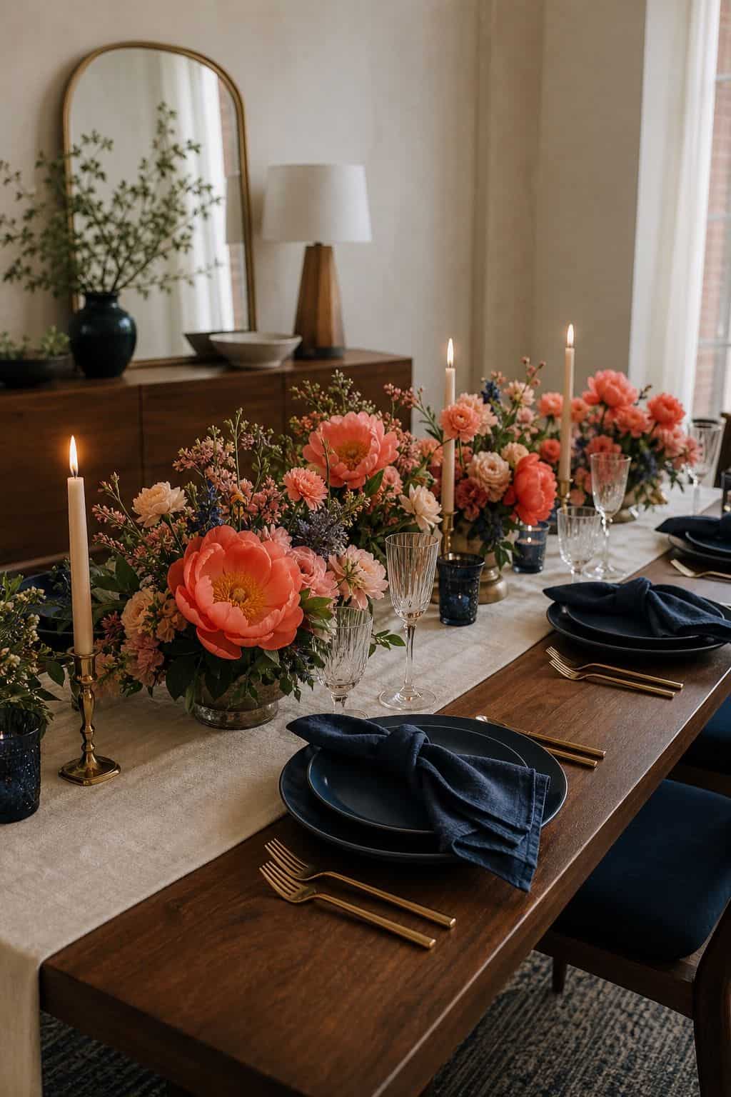


A bold coral with deep navy is one of the strongest spring contrast palettes. Coral florals against navy linens with cream accents creates editorial drama that photographs beautifully and works equally well for casual garden weddings or upscale ballroom celebrations.
6. Magenta, Hot Pink, and Gold


Pantone’s 2023 Viva Magenta is still going strong in spring 2026 wedding palettes. Pair magenta with hot pink florals and gold metallics for a bold, joyful palette that photographs richly and signals modern celebration energy.
Read more: Top 17 Spring Mantle Decor Ideas for a Light Pastel-Floral Fireplace
7. Cobalt Blue, White, and Citrus Yellow
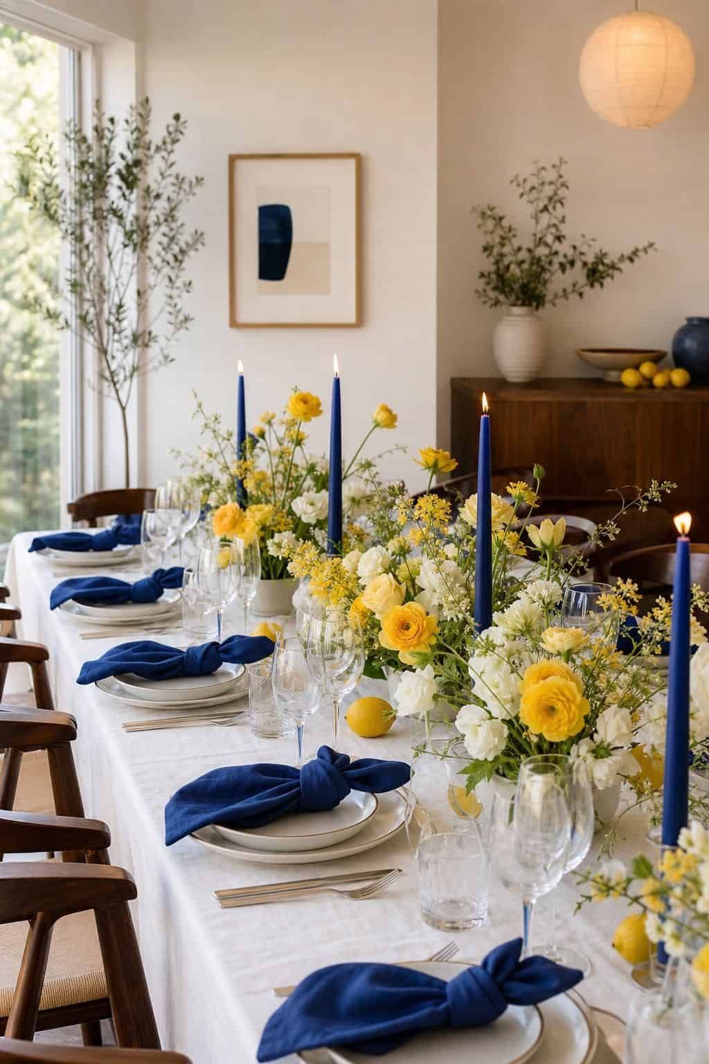


A bold cobalt blue palette with crisp white and a citrus yellow accent reads as fresh, modern, and editorial. The high-contrast palette suits Mediterranean-inspired or garden weddings beautifully, especially when paired with linen and stone decor.
Read more: Top 17 Spring Yard Decor Ideas for a Garden-Ready Outdoor Refresh
8. Emerald Green, Pink, and Gold
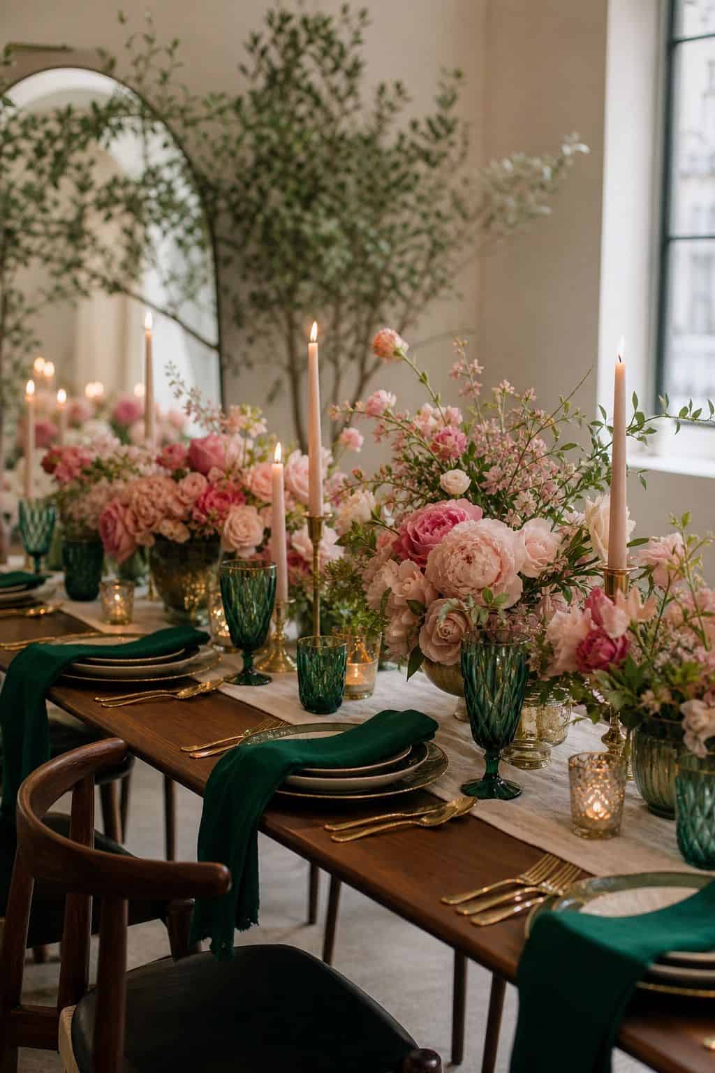


Emerald green and bright pink with gold metallics is the spring palette for couples who want bold drama with classic luxury. Pair emerald linens with pink florals and gold flatware for the kind of color story that lights up reception photos.
Earthy & Natural Tones
9. Sage Green, Terracotta, and Cream


Sage green paired with warm terracotta and cream creates an earthy, garden-grown palette that suits boho, rustic, and minimalist modern weddings equally well. Pair with eucalyptus, cream florals, and wood or rattan accents for the full effect.
This palette also works beautifully with our pampas grass wedding decor for a layered boho garden feel.
Read more: Top 16 Spring Decor Ideas for the Bedroom That Feel Light and Calm
10. Mushroom, Cream, and Soft Gold
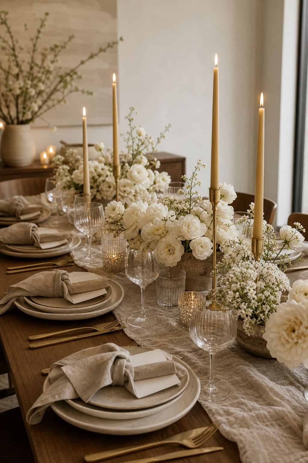


A neutral palette of warm mushroom (a beigy mauve), cream, and soft gold creates a sophisticated, modern spring wedding mood. The palette photographs beautifully in any lighting and works for couples wanting elegance without traditional florals.
Read more: Top 17 Spring Cocktail Party Decor Ideas for a Garden-Party Evening
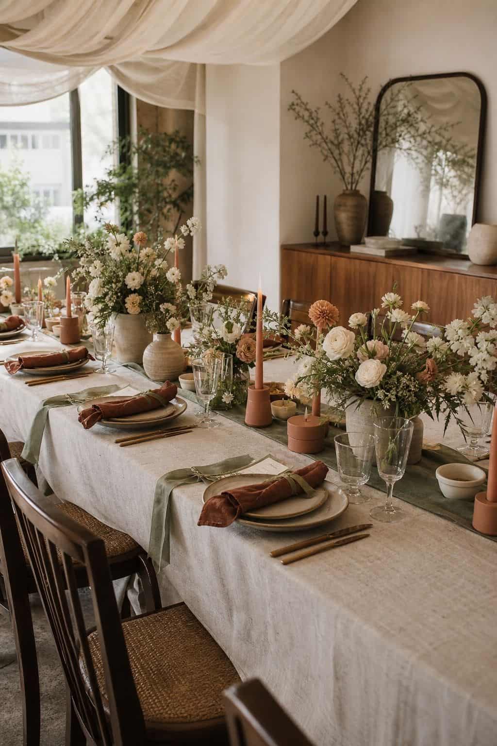
11. Olive Green, Mustard, and Rust
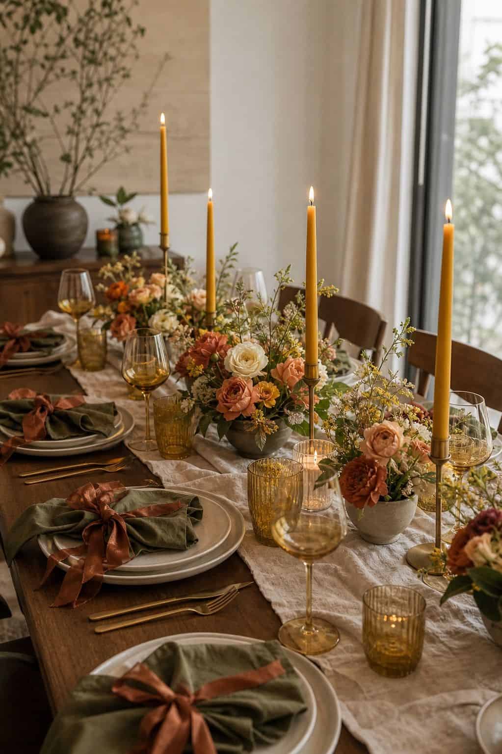


A warm earthy palette of olive, mustard, and rust suits late-spring weddings beautifully, especially Mediterranean or Tuscan-inspired venues. Layer with terracotta pottery, olive branches, and dried elements for a fully cohesive look.
Whimsical Garden Palettes
12. Rainbow Pastels for Garden Whimsy
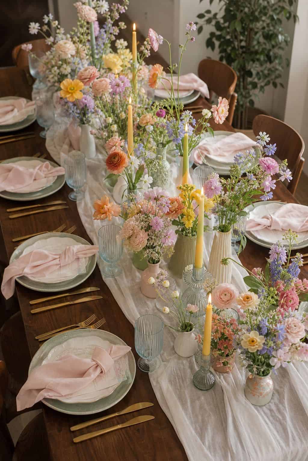


Rather than picking two or three colors, use a soft rainbow of pastels (blush, lilac, mint, butter yellow, peach) across florals and details. This works beautifully for garden weddings where the abundance of color feels intentional rather than chaotic.
Read more: Top 17 Spring Living Room Decor Ideas for a Light-and-Airy Refresh
13. Wildflower Mix with Greenery Anchor
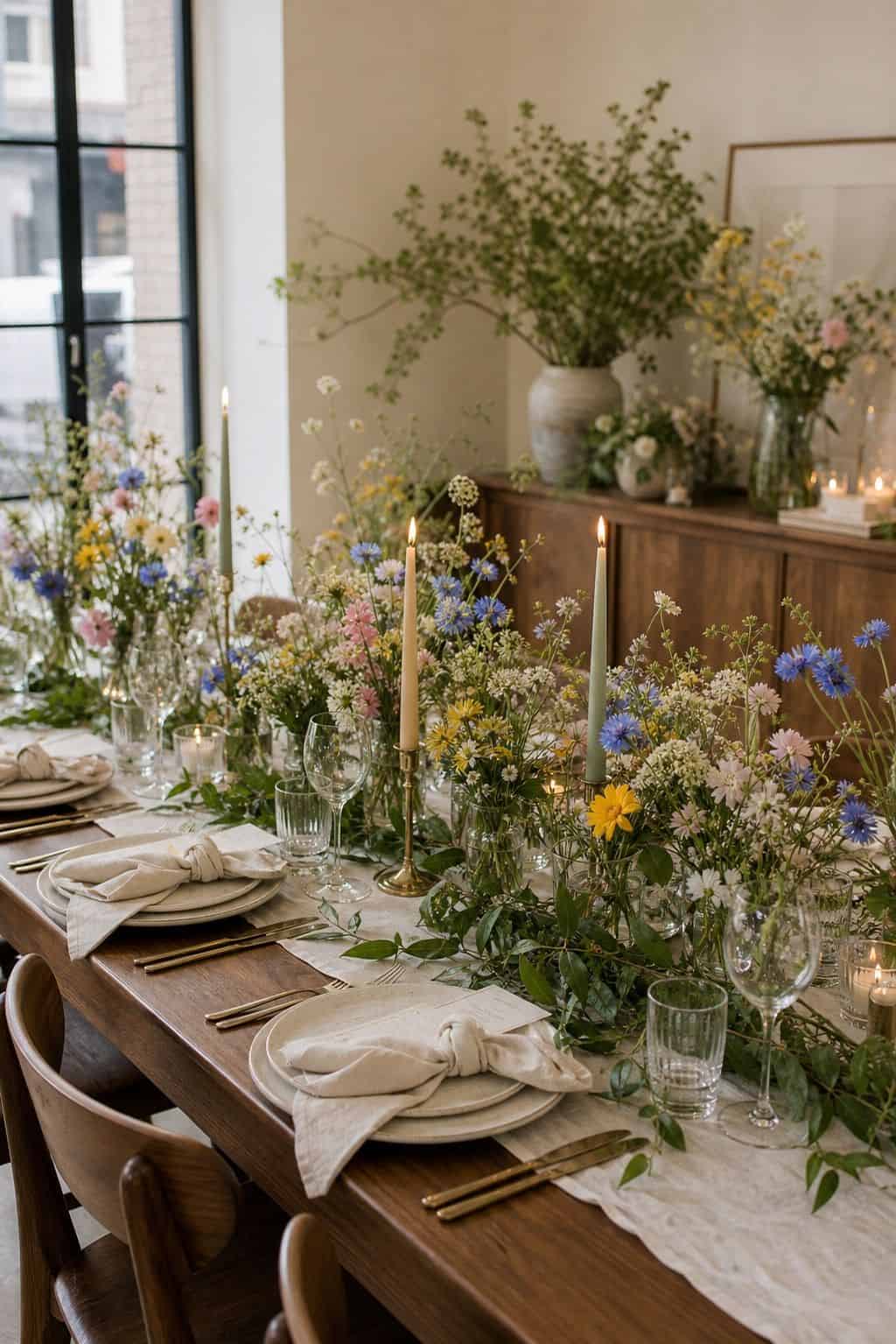


A palette built around wildflower colors (cornflower blue, sunflower yellow, poppy red, white) with greenery as the anchor reads as effortlessly garden-romantic. Pair with mason jar centerpieces and burlap accents for an English country garden vibe.
Read more: Top 17 Spring Tablescape Ideas for a Fresh Hollywood-Cottage Table
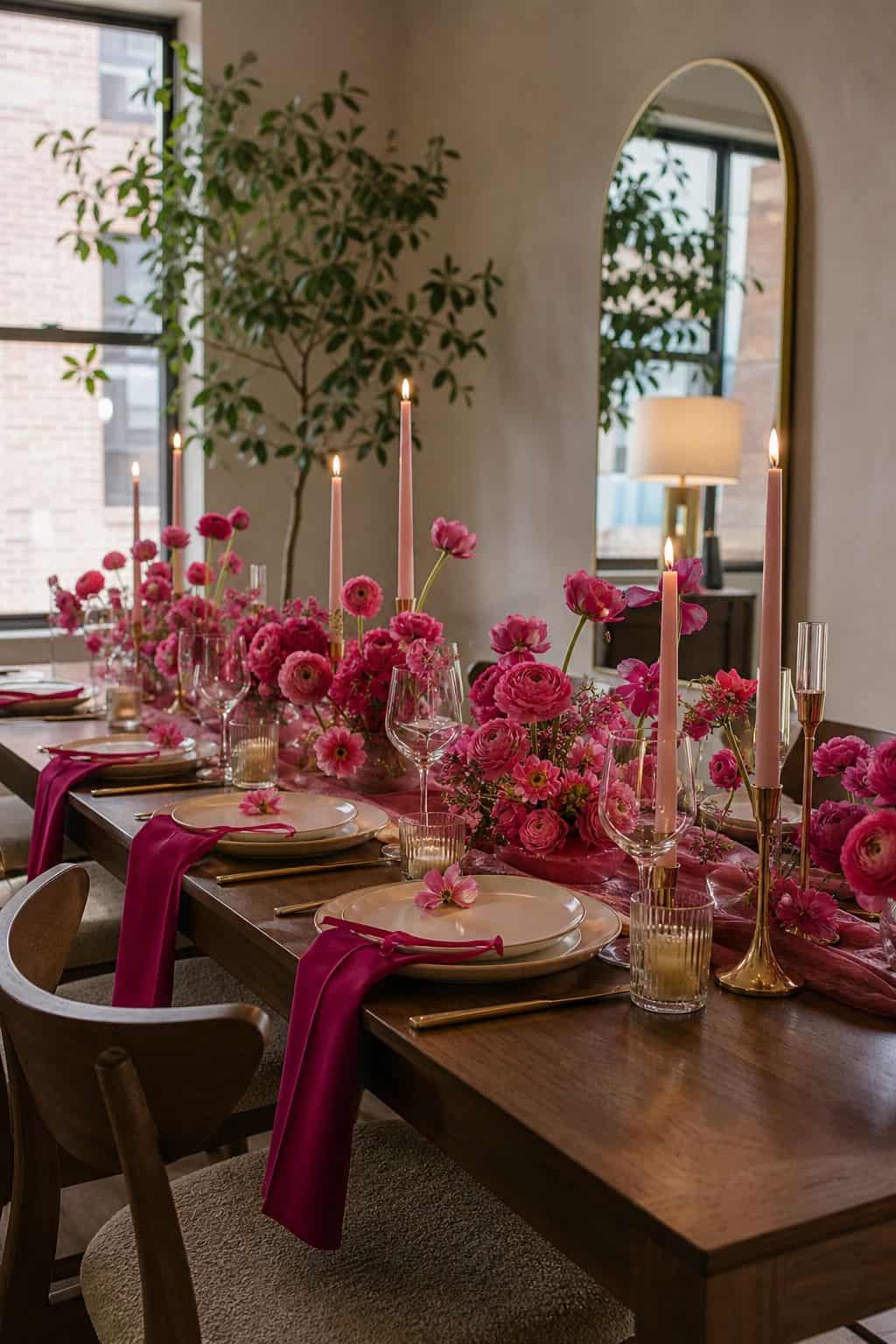
14. Soft Pinks with Pops of Spring Florals
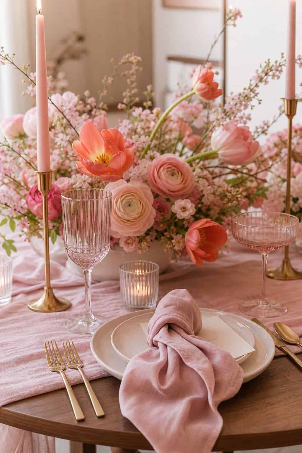


A pink-dominant palette with intentional pops of spring florals like daffodils, tulips, and ranunculus in coordinating shades creates a feminine garden-party feel. Pair with greenery for freshness and avoid heavy metallics.
15. Butter Yellow with White and Greenery
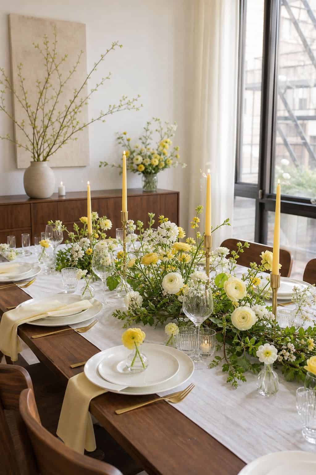


A simpler take on the butter yellow trend uses just yellow, white, and abundant greenery. This works beautifully for outdoor garden ceremonies where the natural backdrop completes the palette without needing to pile on more color.
Read more: Top 18 Easter Party Ideas for a Memorable Spring Gathering
Modern Editorial Palettes
16. Mauve, Dusty Blue, and Champagne
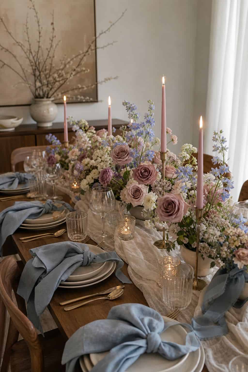


A modern editorial palette of mauve and dusty blue with champagne metallics has become the favorite of high-end wedding stylists. The muted color story photographs beautifully and pairs with both modern and traditional venues.
Read more: Top 16 Spring Entry Table Decor Ideas for a Light and Welcoming
17. Black, White, and Bold Pops of Color
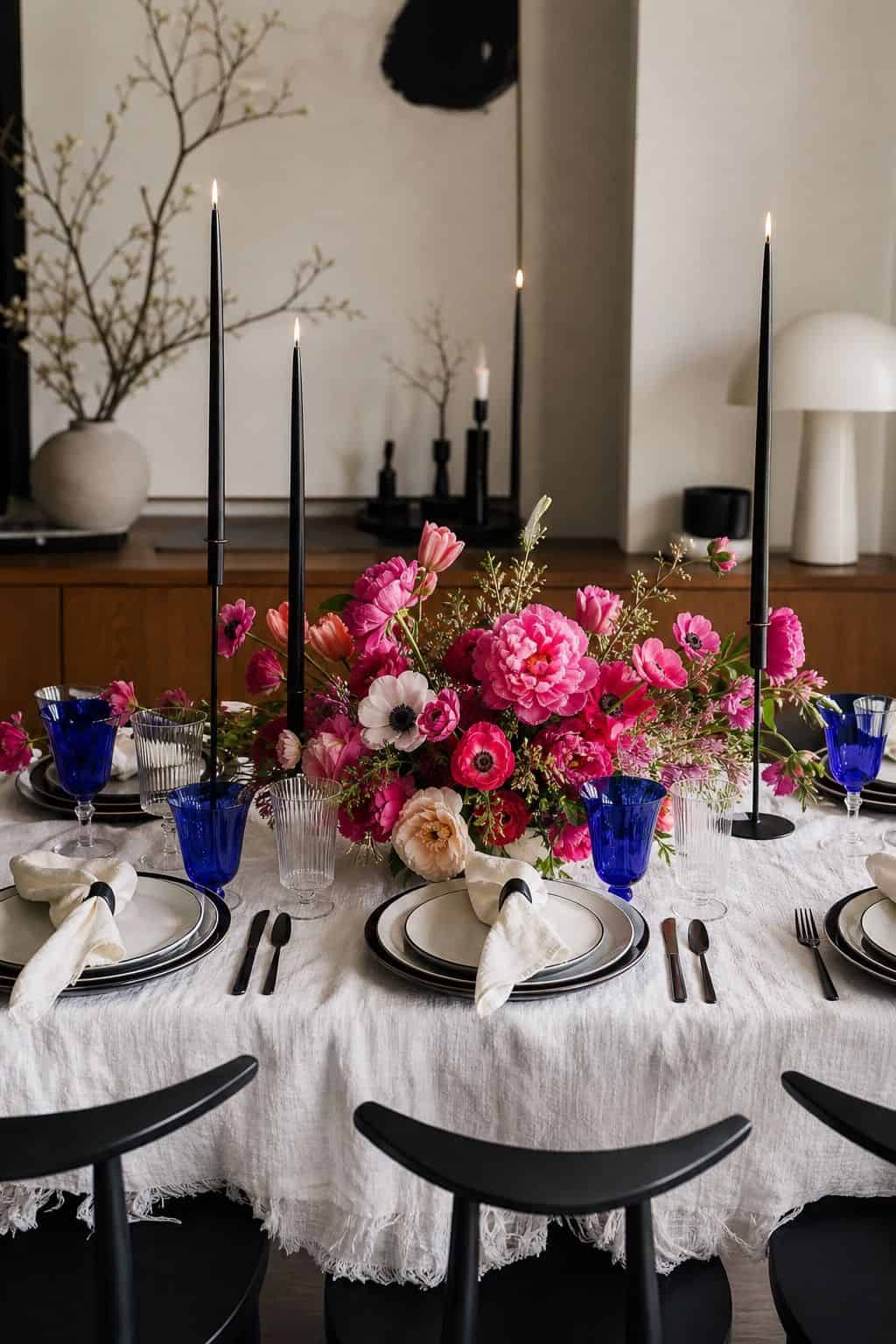


A bold modern palette uses black and white as the foundation with single pops of color (a single bold floral hue, one statement bridesmaid dress color, or one bright table linen). This works beautifully for modern industrial or minimalist venues.
18. Tonal Single-Color Palettes


A tonal palette built entirely around variations of one color (deep burgundy to dusty rose to blush, or pale sage to deep emerald to forest green) creates the kind of layered sophistication that defines high-end editorial weddings. Pair with our summer wedding themes guide for cross-season palette inspiration.
Read more: Top 18 Spring Decor Ideas to Refresh Your Home
Want every spring wedding detail planned without the stress?
The Ultimate DIY Wedding Planner has every checklist, vendor question, and timeline you need to plan your wedding from start to finish. Grab it now for just $4.99 before the price goes up to $19.99.
Frequently Asked Questions About Spring Wedding Color Palettes
What colors are popular for spring weddings 2026?
Butter yellow, sage green with terracotta, dusty blue with mauve, and tonal single-color palettes are the leading 2026 spring wedding palettes. Bold magenta and emerald with gold also remain popular for couples wanting drama.
What is the most popular wedding color?
Soft pinks remain the top wedding color year-round, especially blush and dusty rose. For spring 2026, butter yellow and sage green have grown rapidly in popularity, especially when paired with white and cream.
How do you pick a wedding color palette?
Start with the venue (its existing colors set the tone), then pick one main color, two supporting colors, and one metallic. Keep the palette to four colors total to avoid visual clutter, and test it with sample florals and linens before committing.
How many colors should be in a wedding palette?
Three to four colors is the sweet spot. One main color, one to two supporting colors, and one neutral or metallic. Adding more than four colors risks looking chaotic in photos and overwhelming in the venue.
What spring wedding colors photograph well?
Soft pastels like blush, butter yellow, sage green, and dusty blue all photograph beautifully in spring natural light. Avoid pure neon brights and harsh primary colors, which can look garish in golden hour photography.
Key Takeaways
- Spring wedding color palettes range from soft pastels (blush, butter yellow, lavender) to bold combos (coral and navy, magenta and gold) to earthy tones (sage and terracotta).
- Butter yellow, sage green, and tonal palettes are the leading 2026 spring trends.
- Three to four colors is the sweet spot, with one main color, one to two supporting colors, and one metallic.
- Pull palette inspiration from your venue first and trend reports second to keep the look timeless.
- Soft pastels and earthy tones photograph beautifully in spring natural light, while bold magentas and emeralds add editorial drama.
Final Thoughts
A spring wedding color palette is the single decision that influences every other wedding choice, from florals to bridesmaid dresses to printed materials. Pick a palette that suits your venue, photographs beautifully in natural light, and feels true to your aesthetic rather than chasing trends. Browse the linked Solia spring wedding guides above to keep building a fully cohesive celebration around the palette you choose.
Last update on 2026-07-24 / Affiliate links / Images from Amazon Product Advertising API