
The best sunroom color palettes use soft neutrals, sage greens, and dusty blues that flatter morning light without bouncing harsh glare. Pick three coordinated colors (one dominant wall color, one mid-tone furniture color, one accent), and match the warmth or coolness to your sunroom orientation. South-facing rooms handle cooler palettes, north-facing rooms need warm tones to balance the cool natural light.
Sunroom color palettes are the design decision that quietly shapes how the entire room feels, more than most sunroom decorating ideas let on. Pick the wrong wall color and your sunroom feels cold in February, harsh in July, or just plain off no matter how good the furniture looks. Pick the right palette and the room flatters morning light, holds up in the afternoon, and glows under evening lamps.
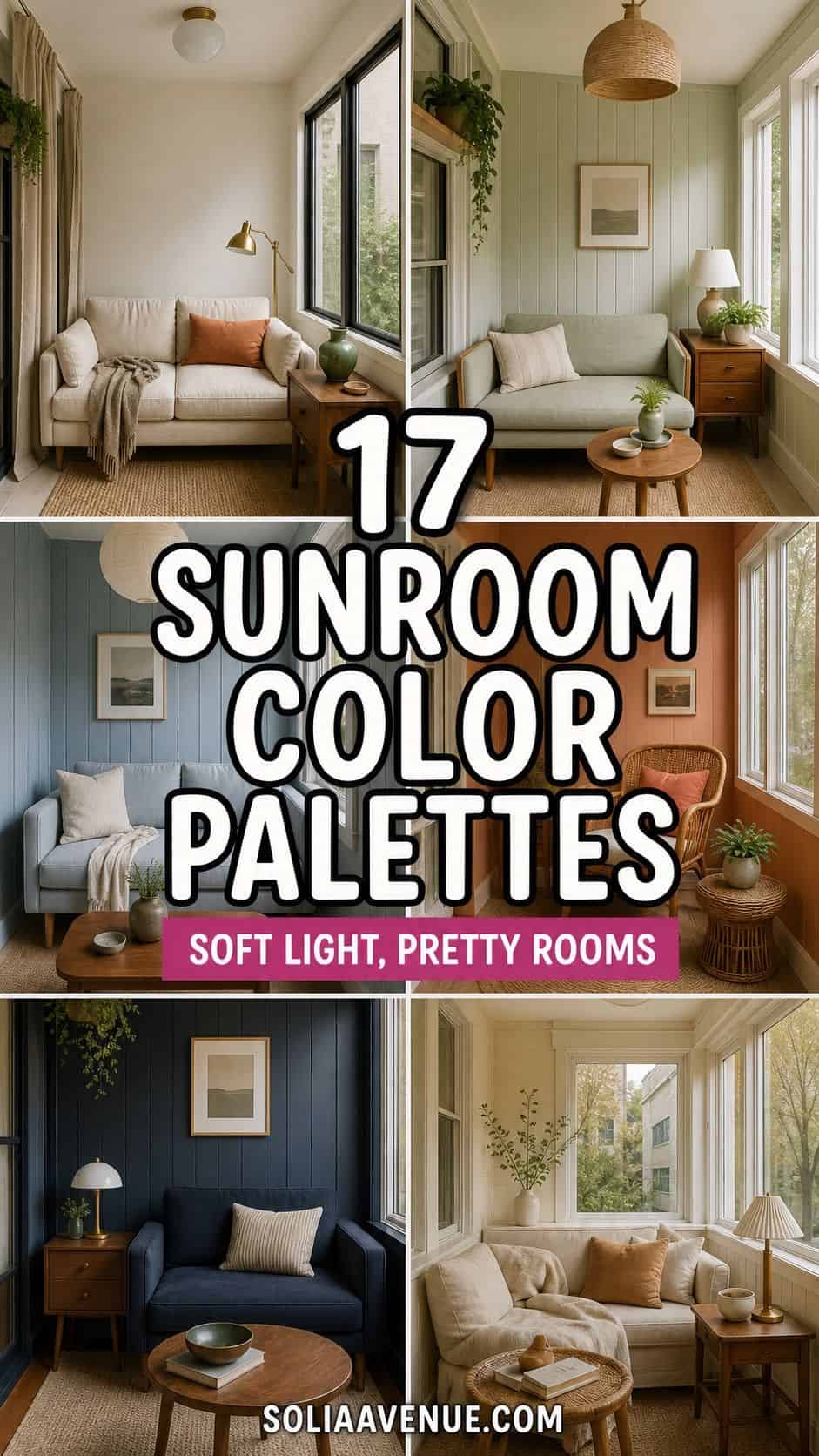
I am going to walk you through 17 sunroom color palette ideas across soft neutrals, sage greens, dusty blues, terracottas, and bold statement palettes, with the orientation rules (north-facing vs south-facing) that most posts skip entirely. Real paint colors, real brand names, and the three-color framework that makes any palette feel cohesive.
Tired of staring at paint samples that all look the same in your sunroom?
The Aesthetic Apartment Makeover Guide walks you through every paint pick with brand callouts and orientation rules, currently just $17 before the price goes up to $27.
Recommended Sunroom Color Palette Products


Recommended blogs to read:
- sunroom decorating ideas for a year-round retreat
- sunroom wall color ideas
- sunroom furniture picks for small spaces
- sage green summer decor ideas
- blue summer decor ideas
Soft Neutral Palettes (Cream, Beige, Greige)
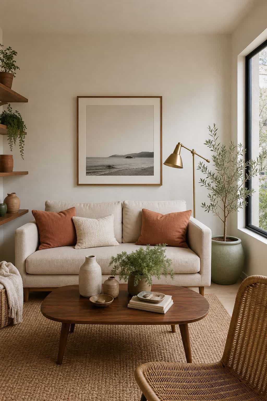
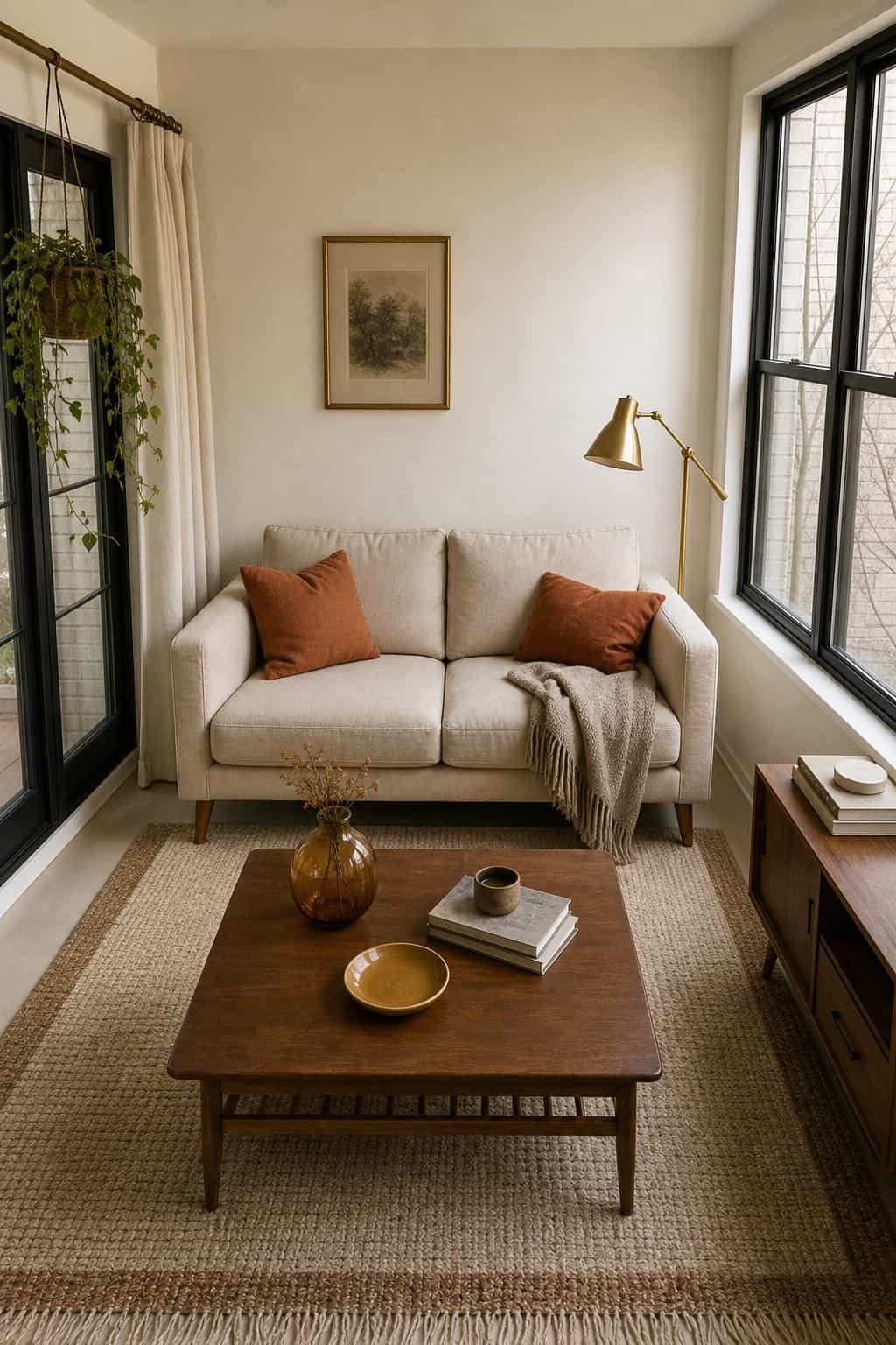
1. Pure Cream and Linen Three-Color Palette
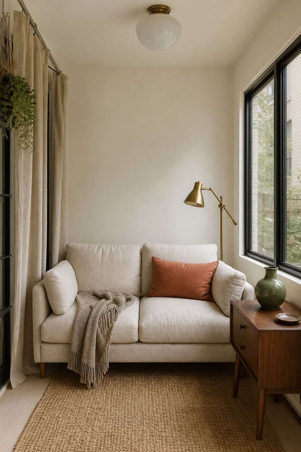


Cream is the palette that never lost. A pure cream palette built on Benjamin Moore White Dove walls, oatmeal linen upholstery, and warm brass accents is the safest sunroom palette possible. The cream backdrop reflects all the natural light without bouncing harsh glare, the linen adds the soft texture sunrooms thrive on, and the brass warms up what could otherwise feel sterile.
Use BM White Dove or Sherwin-Williams Alabaster on walls and ceiling. Cover seating in oatmeal performance linen. Add aged brass floor lamps, picture frames, and pendant fixtures. Layer in a single accent color (sage, dusty blue, or terracotta) through pillows and a throw blanket for the final 5% of the palette weight.
Read also: sunroom decorating ideas | sunroom wall color ideas
Read more: Top 17 Sunroom Wall Color Ideas for a Bright Apartment Retreat
2. Warm Greige with Walnut Wood Tones


A warm greige palette built on Benjamin Moore Edgecomb Gray or Sherwin-Williams Accessible Beige walls plus walnut furniture is the slightly more grown-up neutral option. The greige shifts between warm and cool depending on the light, walnut adds richness, and the combination photographs beautifully against any window view.
Pick a walnut dining table or coffee table as the anchor. Layer in cream throw pillows and a sage or terracotta accent for color punch. The trick with greige is testing samples in your actual sunroom at different times of day, the color reads warmer in morning sun and cooler in afternoon shade. Pair with brass or oil-rubbed bronze hardware.
Read also: sunroom furniture wood tones | sunroom decorating ideas
3. Pure White with Black Window Frames


A pure white sunroom palette with painted black window frames is the modern farmhouse signature. The white walls and ceiling maximize light, the black frames create the architectural grid that makes the windows feel intentional, and the high-contrast palette photographs incredibly against any landscape.
Use BM Simply White or SW Pure White on walls. Paint window frames in BM Black Beauty or SW Tricorn Black. Keep furniture in shades of white, cream, and natural wood for cohesion. Add a single bold accent (deep green, rust, or navy) through a rug or an oversized piece of art. The contrast is the whole point, do not dilute it.
Read also: sunroom aesthetic ideas
Read more: Top 16 Sunroom Office Ideas for a Bright Apartment Workspace
4. Layered Cream and Bone for Subtle Variation
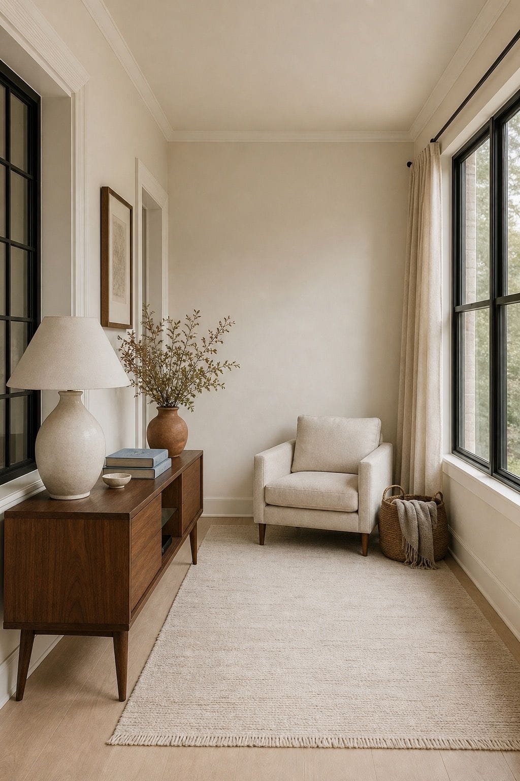


When you want a neutral sunroom but worry about pure white feeling flat, layer two or three off-white shades for subtle variation. Use the warmest white (almost cream) on walls, a slightly cooler bone on the ceiling, and a true white on trim and window frames. The eye reads the room as serene but never flat.
Pick BM Swiss Coffee for walls, BM White Dove for ceiling, BM Chantilly Lace for trim. This is harder than picking a single white, get sample pots and brush large patches at least 18 inches square on each surface before committing. Pair with bleached oak floors and linen upholstery for the full layered-neutral story.
Read also: sunroom decorating ideas | sunroom flooring ideas
Read more: Top 17 Sunroom Curtain Ideas for a Soft, Sun-Drenched Look
Sage Green and Earth Tone Palettes
5. Soft Sage with Cream and Warm Wood
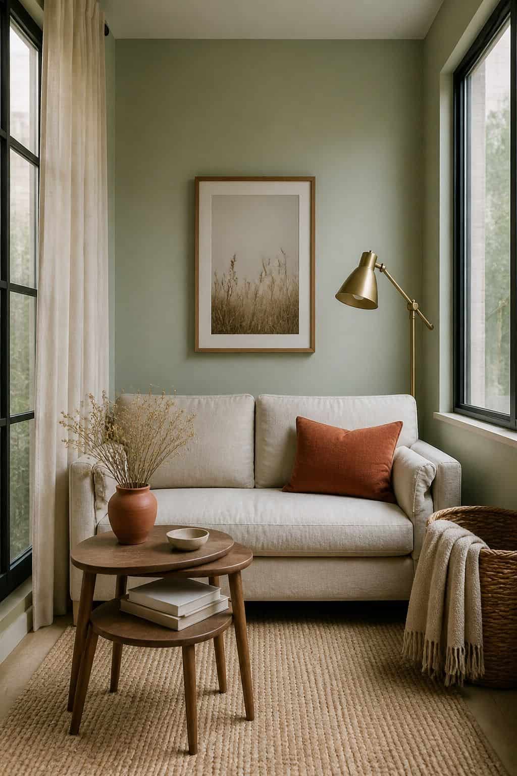


Sage walls feel like a slow exhale. Soft sage green walls (Benjamin Moore Saybrook Sage or Sherwin-Williams Evergreen Fog) with cream furniture and warm wood accents is the calmest sunroom palette in the category. Sage reads soft and organic, never aggressive like darker greens, and the color shifts beautifully across the day as natural light changes.
Use sage on walls only, keep the ceiling pure white to maximize reflected light. Cover seating in cream or oatmeal linen. Add walnut or white oak furniture for the warm-wood contrast. Layer in dried botanicals, brass accents, and a single touch of terracotta through a vase or pillow (more on sage green summer decor ideas) for a desert-meets-garden palette.
Read also: sage green summer decor ideas | sunroom wall color ideas
Read more: Top 18 Plants for Sunroom Ideas to Build a Bright Apartment Garden
6. Olive Green with Brass and Cream
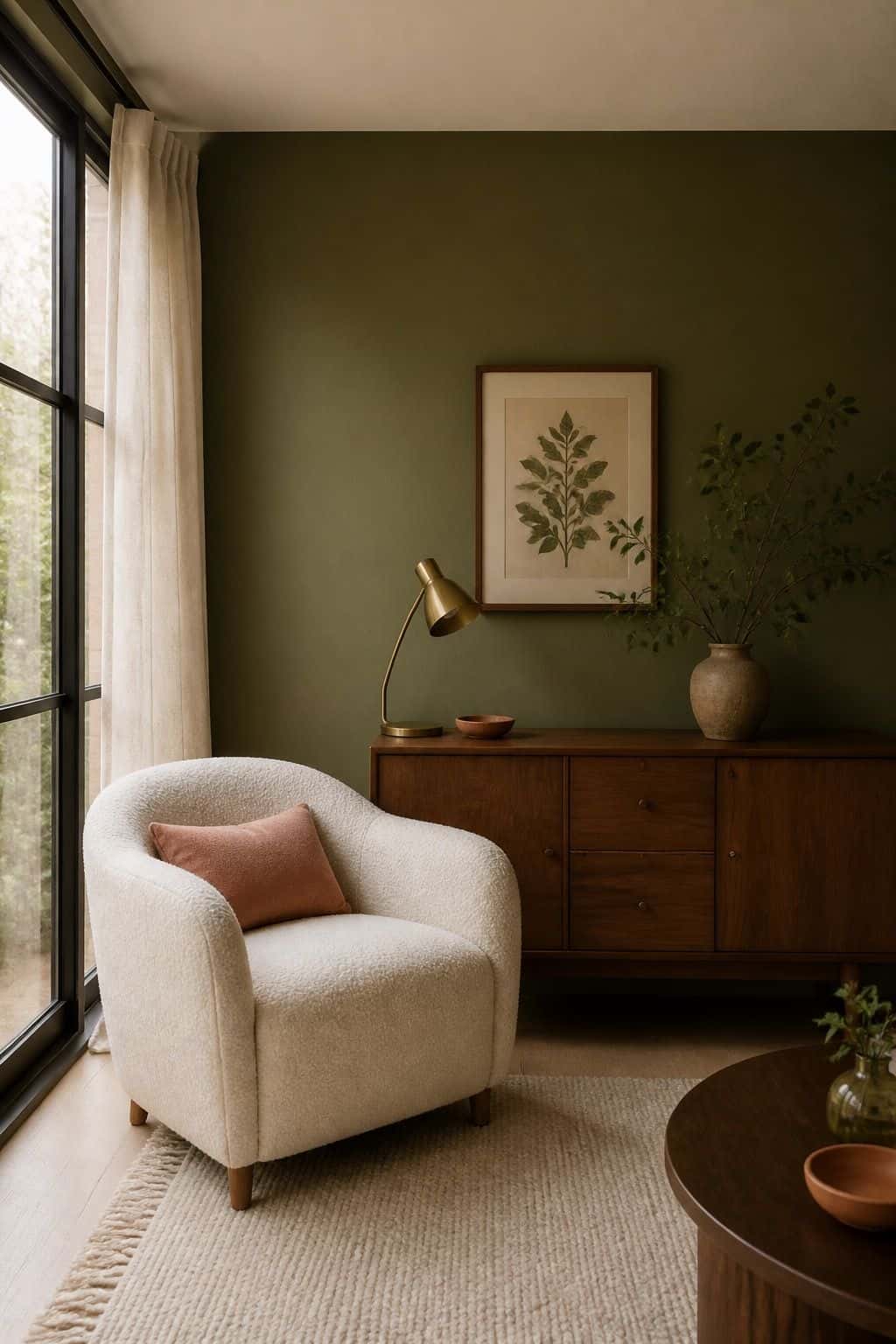


Olive green is the moody-aesthetic upgrade to sage. The deeper, more saturated green grounds a sunroom and creates the layered, lived-in feel that pure-neutral rooms lack. Pair with cream upholstery, aged brass accents, and walnut wood for a palette that feels collected over time, not styled in a weekend.
Use BM Hampshire Gray or SW Rosemary on an accent wall (see our full sunroom wall color ideas) (not all four walls), keep the rest in cream. Cover throw pillows and ottomans in olive performance velvet. Style with brass picture frames and brass floor lamps. Add a single warm-pink accent (dusty rose or terracotta) for the small color punch the palette needs.
Read also: sunroom color palette ideas | sunroom decorating ideas
7. Forest Green with Cream for Drama


Forest green walls in a sunroom sound counterintuitive but work surprisingly well in north-facing or shaded rooms where pure neutrals feel cold. The saturated green reflects the natural foliage outside, creates a jewel-box feel after dark, and pairs beautifully with both warm wood and aged brass fixtures.
Use BM Forest Green or SW Hunt Club on three walls, keep the fourth wall and ceiling in pure white. Cover seating in cream linen or oatmeal boucle. Add walnut wood furniture and brass picture frames. Skip green decor accents because the walls already deliver the color, layer in cream, brass, and warm wood instead for a luxe palette.
Read also: sunroom aesthetic ideas
Read more: Top 15 Sunroom Mudroom Combo Ideas That Maximize Light and Storage
Dusty Blue and Coastal Palettes
8. Pale Dusty Blue with White and Natural Wood
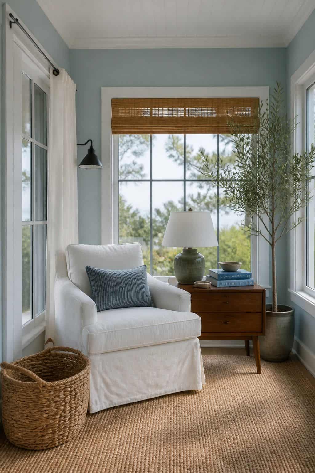


You do not need to live near the water for the coastal feeling to work. A pale dusty blue palette built on Sherwin-Williams Sea Salt or Benjamin Moore Palladian Blue is the classic coastal sunroom move. The blue softens the entire room without dominating, pairs beautifully with bright white trim, and reads as a relaxed beach house even if you are nowhere near the ocean.
Use the dusty blue on walls, keep ceiling and trim in BM White Dove or SW Alabaster. Cover seating in white slipcovered linen. Add light oak or whitewashed wood furniture. Layer in jute area rugs and woven seagrass baskets for the textural finish. Skip darker blues, they fight the natural light instead of working with it.
Read also: blue summer decor ideas | sunroom wall color ideas
Read more: Top 16 Sunroom Playroom Ideas for a Bright Apartment Kids Space
9. Soft Sky Blue Ceiling Over Cream Walls
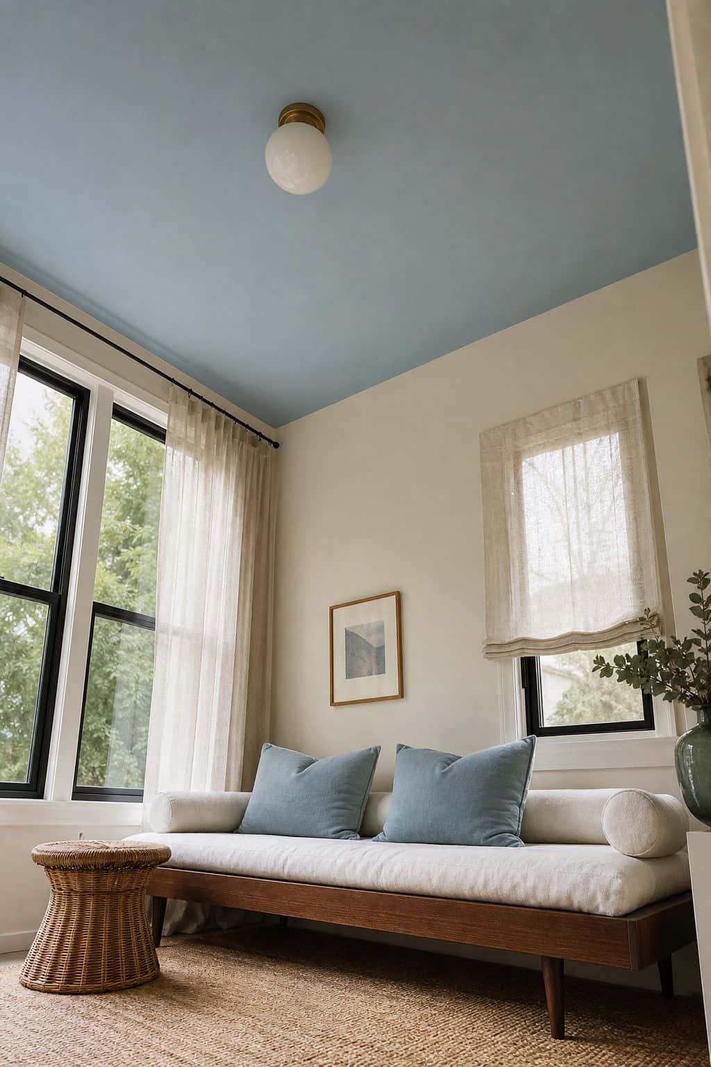


Painting just the sunroom ceiling in pale sky blue (the haint blue tradition) while keeping walls cream is the porch-meets-sunroom palette. The blue overhead echoes the actual sky visible through the windows, the cream walls reflect natural light up to the ceiling, and the combo feels like an outdoor space brought indoors.
Use BM Atmospheric or SW Iceberg on the ceiling only. Walls stay in BM White Dove. Cover seating in white or cream linen, add accent pillows in dusty blue and natural greens. Pair with rattan furniture and jute rugs for the porch-aesthetic finish. This palette photographs beautifully and works in sunrooms of any size.
Read also: sunroom ceiling ideas | sunroom decorating ideas
10. Stormy Blue-Gray for Moody Sunrooms
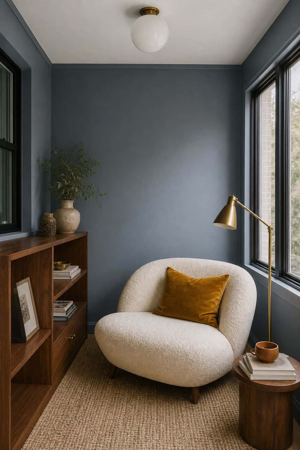


Stormy blue-gray walls (Benjamin Moore Stormy Sky or Sherwin-Williams Storm Cloud) turn a sunroom into a moody, library-like retreat that reads cozy in winter and refined in summer. The dark color makes natural light read crisper by contrast, and the gray-blue undertone keeps the room from feeling cold.
Use the stormy blue on all four walls. Keep ceiling in bright white to lift the room visually. Cover seating in cream boucle or oatmeal performance linen. Add brass picture frames and brass floor lamps for the warm-metal contrast. Style with walnut wood pieces and a single jewel-tone accent (mustard, rust, or emerald) through pillows.
Read also: sunroom aesthetic ideas
Read more: Top 20 Sunroom Decorating Ideas for a Bright Year-Round Apartment
Terracotta and Warm Earth Palettes
11. Soft Terracotta with Cream and Sage


Terracotta is the warmth your gray-and-white kitchen has been missing for years. A soft terracotta palette built on Sherwin-Williams Reddened Earth or Benjamin Moore Audubon Russet with cream walls and sage accents brings desert-meets-Tuscan warmth to a sunroom. The earthy red-orange grounds the room, the cream walls keep things light, and the sage adds the green-leaf contrast.
Use terracotta as an accent color only, never on walls. Cover seating in cream or oatmeal linen, add terracotta throw pillows, a terracotta ceramic vase cluster, and a terracotta-toned area rug. Pair with sage botanicals and brass accents. The trick is restraint, terracotta is a strong color so the palette stays cleaner with less of it.
Read also: sunroom decorating ideas | sunroom color palette ideas
Read more: Top 16 Light-Filled Sunroom Library Inspirations for an Apartment
12. Rich Rust with Walnut for Mediterranean Sunrooms
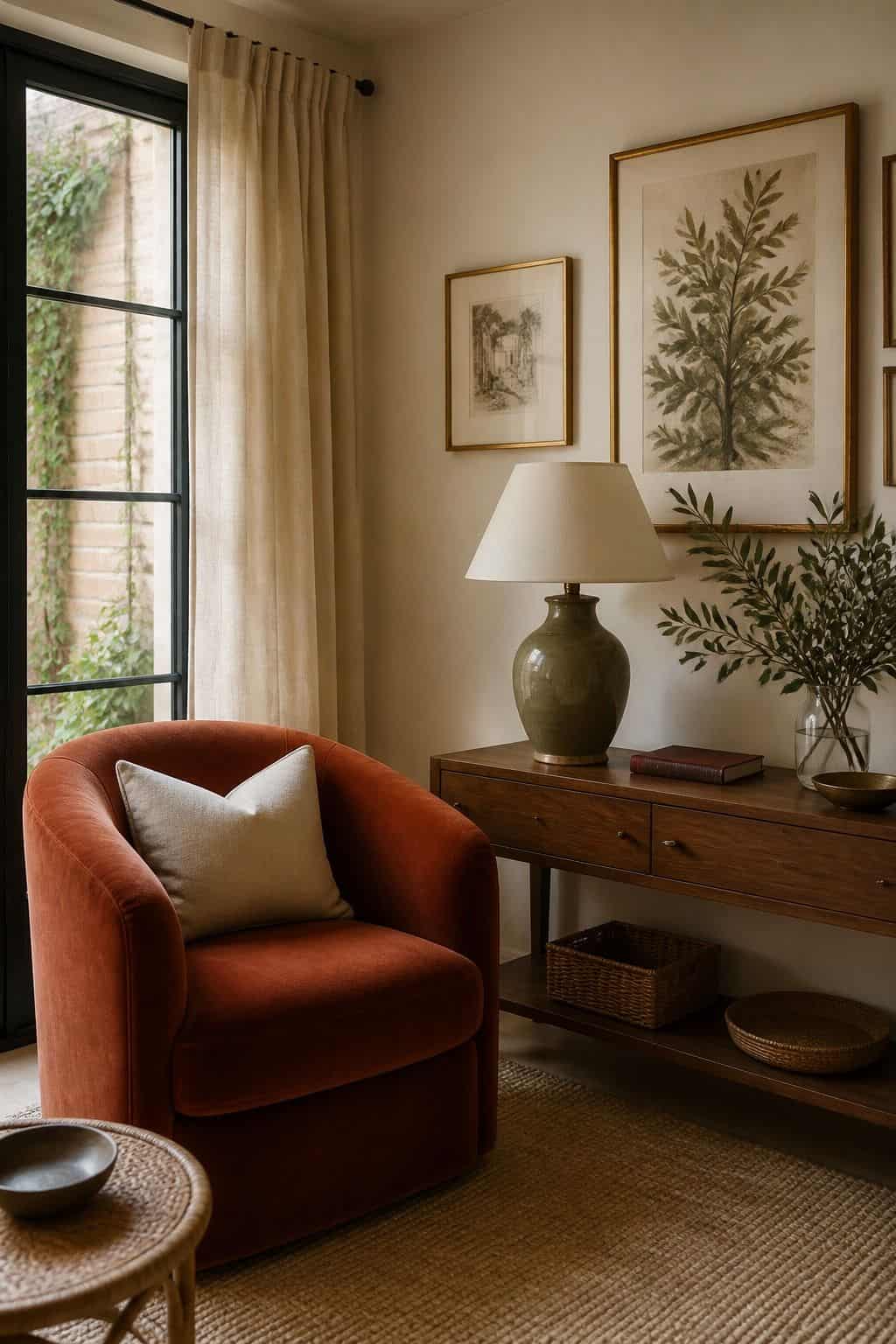


A richer rust palette (deeper than terracotta) paired with walnut wood, cream walls, and brass accents reads as Mediterranean villa rather than desert pottery. The deeper saturation suits formal sunrooms with classic architecture, and the warm tones balance beautifully against the cool natural light of north-facing rooms.
Cover one or two key pieces (an armchair, a sofa, or a large area rug) in rich rust performance velvet. Keep walls in BM Swiss Coffee or SW Sandy Ridge. Add walnut wood furniture and brass picture frames. Layer in cream throw pillows and a single touch of olive green through a botanical print or plant for the full Mediterranean palette.
Read also: sunroom furniture ideas | sunroom aesthetic ideas
13. Warm Mustard with Cream for Vintage Cottage
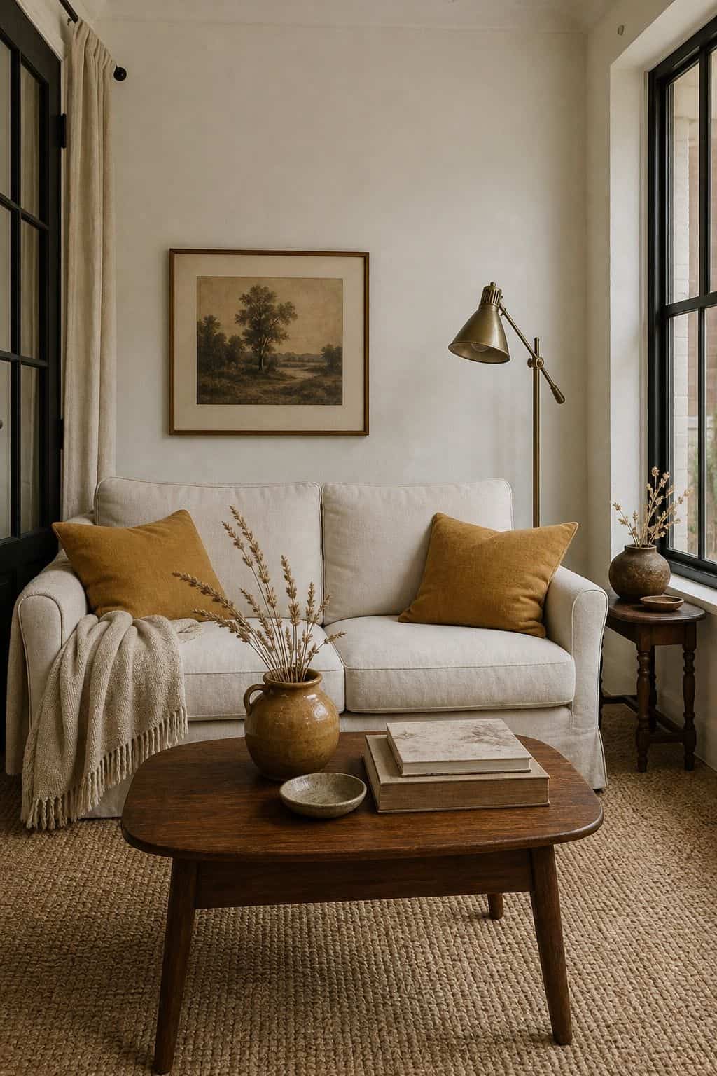


Mustard yellow accents against cream walls give a sunroom the warm, vintage-cottage feeling that pure neutrals miss. The yellow brightens the room without bouncing harsh glare, photographs beautifully against the green view outside, and pairs with both modern and traditional furniture (works the same in blue summer decor) without forcing a single style.
Use mustard sparingly, through throw pillows, a single chair, or one large piece of vintage art. Walls stay in BM Swiss Coffee or BM White Dove. Cover sofa and other seating in cream linen. Add walnut wood and brass accents to extend the warm palette across the room. Layer in dried wheat or pampas grass for the cottage-organic finish.
Read also: sunroom decorating ideas
Read more: Top 17 Cozy Sunroom Lighting Ideas for Warm Evenings
Bold Statement Color Palettes
14. Deep Navy with Brass and Cream


Here is the unexpected move that pays off. Deep navy walls in a sunroom sound risky but work spectacularly when the rest of the palette stays light. Navy creates the jewel-box feel that flips a sunroom from casual to refined, brass accents punch out against the dark, and cream furniture and ceiling keep the room from feeling cave-like despite the saturated walls.
Use BM Hale Navy or SW Naval on all four walls. Paint ceiling in bright white. Cover seating in cream slipcovered linen from our sunroom furniture ideas. Add brass floor lamps, brass picture frames, and a walnut coffee table. Skip navy in the rest of the palette because the walls already deliver enough, layer in cream, brass, and walnut instead for a luxe finish.
Read also: sunroom aesthetic ideas | sunroom wall color ideas
Read more: Top 16 Sunroom Greenhouse Setup Ideas That Actually Work for
15. Soft Pink with Cream and Walnut


A blush pink sunroom built on Benjamin Moore Pink Bliss or Sherwin-Williams Diaphanous walls feels feminine without leaning juvenile. The pale pink reads as a soft neutral in afternoon light, warms up the room in winter, and pairs beautifully with both walnut wood and cream linen upholstery for a grown-up palette.
Use the blush pink on walls only, keep ceiling and trim pure white. Cover seating in cream linen or oatmeal boucle. Add walnut or white oak wood pieces. Layer in dried roses or pampas grass for the styled-organic finish. Skip pink decor accents, the walls already deliver the color, add brass and cream for cohesion.
Read also: sunroom aesthetic styling
Read more: Top 17 Sunroom Dining Room Ideas That Make Every Meal Feel Special
Lighting and Color Considerations
16. North-Facing Sunrooms Need Warm Palettes


North-facing sunrooms get cool, gray-tinted natural light all day long. The light is consistent but never warms up, which makes pure-cool palettes (gray, blue, white-only) feel cold and uninviting. Warm palettes (cream, terracotta, mustard, olive) balance the cool light and make the room feel welcoming even in winter.
Stick to wall colors with warm undertones, look for color cards that lean toward yellow or red, not blue or green. Cover seating in oatmeal, cream, or warm white performance fabric. Add walnut or oak wood, never gray-toned wood. Brass and aged bronze fixtures add the warm-metal contrast that cool-tone north-facing rooms always need.
Read also: sunroom wall color ideas | sunroom decorating ideas
17. South-Facing Sunrooms Handle Cool Palettes


South-facing sunrooms get warm, golden natural light for most of the day. The warm light overcompensates for cool palettes, which means south-facing rooms are the only ones where pure white walls, gray-toned woods, and silver-toned accents actually work. Cool palettes balance the constant golden light flooding the room.
Use BM Simply White or SW Pure White on walls and ceiling. Cover seating in pale gray or white slipcovered linen. Add pale or whitewashed wood furniture and chrome or polished nickel fixtures. Layer in cool blues, pale greens, and soft purples for accent colors. Skip mustard and terracotta in south-facing rooms, the warm light pushes them into orange territory.
Read also: sunroom aesthetic ideas | sunroom color palette ideas
Read more: Top 16 Best Sunroom Ceiling Ideas
Want the full sunroom palette, not just one wall color?
The guide gives you the three-color framework for every room in your home so the whole space hangs together, currently just $17 before the price goes up to $27.
Frequently Asked Questions
What is the best color palette for a sunroom?
Soft neutrals (cream, oatmeal, greige) work in any sunroom orientation. Sage green and dusty blue are the safest accent colors. Pick three coordinated colors, one dominant wall color, one mid-tone furniture color, one accent. Match warm or cool palettes to your sunroom orientation, north-facing rooms need warm tones, south-facing rooms handle cool.
How do you pick 3 colors for a sunroom?
Start with the wall color (60% of the palette), then pick a mid-tone for major furniture and rugs (30%), then an accent for pillows and art (10%). All three should share the same undertone, either all warm (cream, walnut, terracotta) or all cool (white, gray, dusty blue). Mixing undertones makes a sunroom feel unsettled.
Should sunroom palettes be warm or cool?
Match the palette to your sunroom orientation. North-facing sunrooms get cool natural light all day and need warm palettes (cream, terracotta, mustard) to balance the gray-tinted light. South-facing sunrooms get warm golden light and can handle cool palettes (white, gray, dusty blue). East-facing and west-facing rooms work with either.
What palette makes a sunroom feel bigger?
Pure white or pale cream palettes maximize reflected light, which makes the room feel taller and wider. Keep ceiling and walls in the same light shade for visual continuity. Use the same pale tone on trim and window frames so the architecture disappears and the room reads as one open volume. Add accent colors through textiles, not walls.
Can you use bold colors in a sunroom?
Yes, on the walls. Deep navy, forest green, or stormy blue-gray turn a sunroom into a jewel-box retreat that reads cozy in winter and refined in summer. Keep ceiling and trim in pure white to lift the room visually. Cover furniture in cream or oatmeal to balance the saturated walls. Skip bold decor accents, the walls do the work.
Key Takeaways
- Pick three coordinated colors at 60-30-10 ratio (wall, furniture, accent) with matching undertones for a cohesive palette.
- North-facing sunrooms need warm palettes (cream, terracotta, mustard) to balance the cool natural light.
- South-facing sunrooms handle cool palettes (white, gray, dusty blue) because the warm golden light balances them.
- Sage green, dusty blue, and soft cream are the safest sunroom accent colors that work in any orientation.
- Bold wall colors (navy, forest green, stormy blue) work when ceiling and trim stay pure white and furniture stays cream.
Final Thoughts
The right sunroom palette disappears into the rest of the room because nothing about it nags you. Walls flatter morning light, furniture grounds the space, and accent colors deliver the small punch the palette needs without dominating. Pick warm or cool tones based on your orientation, lock in three coordinated colors, and the rest of the design falls into place.
Last update on 2026-07-25 / Affiliate links / Images from Amazon Product Advertising API